


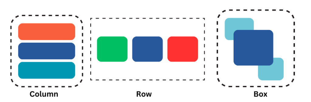
In Jetpack Compose, a layout is a component used to arrange and position other composables on the screen. Layouts play a crucial role in defining the structure and organization of the user interface. Row, Column, and Box are layout components used to arrange composables horizontally, vertically, and in a stack, respectively. Here’s a simple explanation of how each one arranges its children:
Prerequisites:
Row
The Row composable arranges its children horizontally from left to right. You can think of it as a linear layout where elements are placed in a single row, placing them next to each other. The default behavior of Row is to wrap its content, its size is determined by the size of its children and the layout constraints imposed by its parent or the screen. Let’s take an example
@Composable
fun SampleRow(){
    Row {
        Text(text = "Text 1",Modifier.background(Color.Red))
        Text(text = "Text 2",Modifier.background(Color.White))
        Text(text = "Text 3",Modifier.background(Color.Green))
    }
}
here is the output of above code
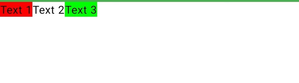
In this example Row composable arranges its children horizontally. In this case, three Text composables are placed next to each other in a row.
Column
The Column composable arranges its children vertically from top to bottom. It’s similar to a linear layout where elements are stacked in a single column. The default behavior of Column is to wrap its content based on the size of its children. you can control the width and height of a Column using modifier. Let’s take an simple example of Column composable.
@Composable
fun ColumnSample(){
    Column {
        Text(text = "Text 1",Modifier.background(Color.Red))
        Text(text = "Text 2",Modifier.background(Color.White))
        Text(text = "Text 3",Modifier.background(Color.Green))
    }
}
here is the output of above code
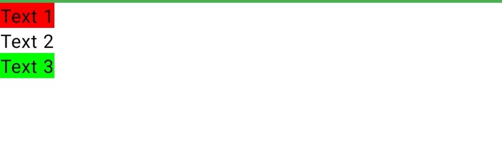
Here the Column composable is used to arrange its children vertically. In this case, three Text composables are placed one below the other.
Box
“Box” is a simple container that can hold one or more composable elements. It allows you to arrange composables within a box-like structure. The Box composable provides a convenient way to position and stack composables inside it. Let’s take an example
@Composable
fun BoxSample() {
    // Box composable
    Box(
        modifier = Modifier
            .fillMaxSize()
            .padding(16.dp)
    ) {
        // Composable elements inside the Box
        Text(
            text = "Hello from Box!",
            fontSize = 30.sp
        )
        Text(
            text = "Another Text Composable",
            fontSize = 20.sp
        )
    }
}
Here is Output of this code
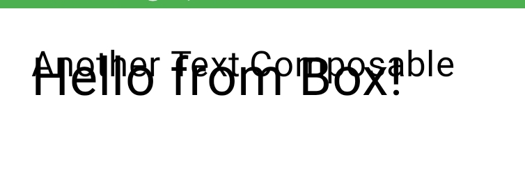
if you add multiple children to a Box, they are stacked on top of each other by default. The order in which you add the children to the Box determines their stacking order, with the last child added being rendered on top.
Using modifiers in your layouts
modifiers are used to apply various layout and styling changes to composables. Modifiers allow you to control the size, position, padding, and other visual properties of UI elements. Here’s how modifiers work in the context of Row, Column, and Box composables:
Composables take a modifier parameter that allows you to apply layout and size-related modifications.
Row(
    modifier = Modifier
        .fillMaxWidth()            // Occupies the entire available width
        .height(50.dp)             // Sets a fixed height
        .padding(16.dp)            // Adds padding around the Row
        .background(Color.Gray)    // Sets the background color
) {
    // Children go here
}
In this example:
fillMaxWidth(): Occupies the entire available width in the parent container.height(50.dp): Sets a fixed height for the Row.padding(16.dp): Adds 16dp padding around the Row.background(Color.Gray): Sets the background color of the Row to gray.
Here’s a concise explanation of several commonly used properties in Jetpack Compose modifiers:
fillMaxWidth(): Makes the composable take up the entire available width within its parent container.fillMaxHeight(): Makes the composable take up the entire available height within its parent container.padding():Adds padding around the composable to create space between its content and its boundaries.height(value: Dp): Sets a fixed height for the composable.width(value: Dp): Sets a fixed width for the composable.background(Color): Sets the background color of the composable.clickable(onClick: () -> Unit): Makes the composable clickable and triggers the providedonClicklambda when clicked.